

毎月、GOWUKAKUは1500人以上の受験者が試験準備を助けて、試験に合格するために受験者にご協力します
SAP Certified Application Associate - SAP Analytics Cloud Story Design 試験
最新更新時間: 2026/09/21
【秋学習応援セール|10月限定キャンペーン】:C_SACS_2308 最新真題を買う時、日本語版と英語版両方を同時に獲得できます。
実際の問題集を練習し、試験のポイントを了解し、テストに申し込むするかどうかを決めることができます。
さらに試験準備時間の35%を節約するには、C_SACS_2308 問題集を使用してください。
Question No : 1
What can be done with story filters?
正解:
Explanation:
Story filters are a feature that allows you to filter the data in a story based on one or more dimensions or measures. You can use story filters to do the following:
They can be applied to all widgets based on the same model. You can choose which widgets are affected by the story filter and which are not.
They can be used to create dynamic titles or text based on the filter values. You can insert filter tokens into titles or text elements to show the current filter values.
They can be used to create input controls that allow users to change the filter values interactively. You can add input controls such as drop-down lists, sliders, checkboxes, etc., to let users select their own filter values.
Story filters cannot do the following:
They cannot be implemented without a model in a template. You need to have a model as a data source for your story before you can apply story filters.
They cannot be used to change dimensions in a widget. You cannot use story filters to swap dimensions in a widget. You have to use the chart builder or the table builder to change dimensions in a widget.
Therefore, the correct answer is They can be applied to all widgets based on the same model, as it is what can be done with story filters.
Reference: : Filter Data in Stories
Question No : 2
What are benefits of using the Optimized Design Experience? Note: There are 2 correct answers to this question.
正解:
Explanation:
The Optimized Design Experience is a new user interface for SAP Analytics Cloud that simplifies and enhances the story design process. The Optimized Design Experience offers some benefits over the Classic Design Experience, such as:
Improved tooltip interactions: You can hover over any data point in a chart to see a tooltip with more information. You can also click on the tooltip to access more actions, such as filtering, drilling, commenting, etc.
Ghost loading indicators: You can see a ghost image of the elements on a page while they are loading. This gives you a preview of the layout and size of the elements before they are fully rendered.
Data Analyzer: You can use Data Analyzer to quickly create ad hoc analysis based on models or datasets. You can also save your analysis as stories or pin them to your home page.
Point of Interest: You can use Point of Interest to highlight a specific data point or area in a chart. You can also add annotations, comments, or links to the Point of Interest.
Time Series chart: You can use Time Series chart to create interactive and animated charts that show how data changes over time. You can also customize the appearance and behavior of the Time Series chart.
Therefore, the correct answer is Improved tooltip interactions and Ghost loading indicators, as they are the benefits of using the Optimized Design Experience.
Reference: Optimized Design Experience Overview
Question No : 3
What language does the Custom Expression Editor use?
正解:
Explanation:
The Custom Expression Editor is a tool that allows you to create complex calculations using a syntax called Wrangling Expression Language (WEL). WEL is a domain-specific language that is designed for data manipulation and analysis. WEL supports various operators, functions, and constants that you can use to create custom expressions. You can access the Custom Expression Editor from various places in SAP Analytics Cloud, such as models, stories, datasets, etc. Therefore, the correct answer is Wrangling Expression Language, as it is the language that the Custom Expression Editor uses. Verified
Reference: Create Custom Expressions with the Custom Expression Editor
Question No : 4
When converting a story to Optimized Design Experience, what happens if the story contains elements that are not yet supported?
正解:
Explanation:
When converting a story to Optimized Design Experience, you need to be aware that some elements that are available in the Classic Design Experience are not yet supported in the Optimized Design Experience.
These elements include:
Grid pages
Linked analysis
Geo maps
Images
Shapes
Texts
Buttons
Input controls
Value driver trees
Explorer
If your story contains any of these elements, you will receive a warning message before converting the story, informing you that these elements will be permanently deleted from the story. You can choose to proceed with the conversion or cancel it. If you proceed, the unsupported elements will be removed from the story, and you will not be able to restore them1.
Reference: 1: Optimized Story Experience | SAP Help Portal
Question No : 5
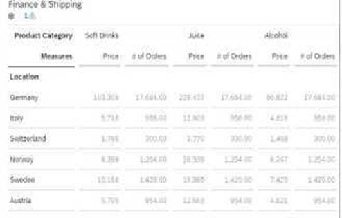
When you are adding a calculation to a table (see graphic below) and choose Single, to which of the following is the new column added?
正解:
Explanation:
When you are adding a calculation to a table, you can choose from two options: Single or Multiple. The option determines how many new columns are added to the table based on the calculation.
The options are:
Single: Adds one new column to the table with the calculation result for the selected dimension member. For example, if you select Soft Drinks and choose Single, you will get one new column with the calculation result for Soft Drinks only.
Multiple: Adds multiple new columns to the table with the calculation result for each dimension member. For example, if you select Soft Drinks and choose Multiple, you will get three new columns with the calculation result for Soft Drinks, Juice, and Alcohol.
Therefore, the correct answer is Selected dimension member, as it is the option that the new column is added to when you choose Single.
Reference: : Create Calculations in Tables
Question No : 6
Which calculation type does the SAP BW live model support?
正解:
Explanation:
The SAP BW live model is a type of live data connection that allows you to access data from SAP Business Warehouse (BW) systems without importing it into SAP Analytics Cloud.
The SAP BW live model supports the following calculation types:
Aggregation: You can use aggregation functions, such as SUM, COUNT, MIN, MAX, etc., to calculate the values of a measure based on a dimension or a filter.
Currency conversion: You can use currency conversion to convert the values of a measure from one currency to another based on predefined exchange rates.
Unit conversion: You can use unit conversion to convert the values of a measure from one unit of measurement to another based on predefined conversion factors.
The SAP BW live model does not support the following calculation types:
Dimension to measure: You cannot convert a dimension to a measure in a SAP BW live model.
Date difference: You cannot calculate the difference between two dates in a SAP BW live model.
Story calculation: You cannot create story calculations in a SAP BW live model.
Therefore, the correct answer is Aggregation, as it is the calculation type that the SAP BW live model supports.
Reference: : Create Calculations in Models: SAP BW Live Data Connection
Question No : 7
What are data sources for stories? Note: There are 3 correct answers to this question.
正解:
Explanation:
A data source is an object that contains data that you can use to create stories or other objects in SAP Analytics Cloud. There are four types of data sources in SAP Analytics Cloud:
Model: A model is a structured representation of your data that defines how the data is organized and calculated. You can create models by importing data from various sources or connecting to live data systems.
Dataset: A dataset is a type of data source that allows you to import data from files
Question No : 8
What is the maximum number of screens you can connect to the Digital Boardroom?
正解:
Explanation:
The Digital Boardroom is a feature that allows you to create immersive and interactive presentations based on stories. You can use the Digital Boardroom to present your data and insights on multiple screens connected to a single device. The Digital Boardroom supports up to three screens that can display different views of the same story or different stories. Therefore, the correct answer is 3, as it is the maximum number of screens you can connect to the Digital Boardroom. Verified
Question No : 9
Which element is NOT available in the Optimized Design Experience?
正解:
Explanation:
The Optimized Design Experience is a new user interface for SAP Analytics Cloud that simplifies and enhances the story design process. The Optimized Design Experience introduces some new elements and tools, such as Data Analyzer, Point of Interest, Time Series chart, etc. However, it also removes some elements and tools that are available in the Classic Design Experience, such as Grid page, Explorer, Digital Boardroom, etc. Therefore, the correct answer is Grid page, as it is the element that is not available in the Optimized Design Experience.
Question No : 10
Which page type is recommended when designing stories?
正解:
Explanation:
A page type is a property that determines how the elements on a page are arranged and displayed. There are three page types in SAP Analytics Cloud: Canvas, Grid, and Responsive. The page type that is recommended when designing stories is Responsive, as it offers the following advantages:
It automatically adjusts the layout and size of the elements to fit different screen sizes and orientations.
It provides a consistent and optimal viewing experience across different devices, such as desktops, tablets, and mobile phones.
It supports all types of elements, such as charts, tables, geo maps, images, text, etc.
It supports advanced features, such as linked analysis, input controls, story filters, etc. Therefore, the correct answer is Responsive, as it is the recommended page type when designing stories.
Question No : 11
What are limitations of datasets?Note: There are 2 correct answers to this question.
正解:
Explanation:
A dataset is a type of data source that allows you to import data from files, such as Excel or CSV files.
You can use datasets to create stories or blend data with models. However, datasets have some limitations, such as:
They cannot be scheduled. You have to manually refresh the data in a dataset.
They do not support column-based or property security. You cannot restrict access to certain columns or properties in a dataset.
They do not support transformations. You cannot apply any transformations to the data in a dataset. They can overwrite imported data. You can choose to append or replace the data in a dataset when you import a new file.
Therefore, the correct answer is They cannot be scheduled and They do not support column-based or property security, as they are the limitations of datasets.
Question No : 12
In the Optimized Design Experience, which SAP Analytics Cloud tool replaces Explorer?
正解:
Explanation:
In the Optimized Design Experience, Data Analyzer is a new tool that replaces Explorer. Data Analyzer allows you to quickly create ad hoc analysis based on models or datasets. You can use Data Analyzer to explore data, create charts and tables, apply filters and calculations, and save your analysis as stories.
Data Analyzer is similar to Explorer, but with some enhancements and new features, such as:
Support for both models and datasets
Support for planning models
Support for story calculations
Support for linked analysis
Support for responsive pages
Therefore, the correct answer is Data Analyzer, as it is the tool that replaces Explorer in the Optimized Design Experience
Question No : 13
Which of the following can you use to create a chart for each member of a dimension?
正解:
Explanation:
A section is a way of organizing a story into different parts based on a dimension. A section creates a separate page for each member of the dimension, and displays the same widgets on each page with the data filtered by the section dimension1. For example, if you create a section based on the Country dimension, you will have a page for each country in your data, and the charts and tables on each page will show only the data for that country. The other options are not correct because:
Value Driver Tree: This is a widget that allows you to create a graphical representation of how different drivers affect a key performance indicator (KPI). You can use this widget to perform simulations and what-if scenarios on your data2. However, this widget does not create a chart for each member of a dimension.
In-Cell Charts: These are mini charts that are displayed within table cells to show the relative values of measures. You can use this feature to enhance the readability and analysis of your data3. However, this feature does not create a chart for each member of a dimension.
Trellis: This is a feature that allows you to split a chart into multiple smaller charts based on one or more dimensions. You can use this feature to compare and contrast different segments of your data4. However, this feature does not create a separate page for each member of a dimension.
Reference: 1: Creating Sections - SAP Learning 2: Using Value Driver Trees - SAP Learning 3: Using In-Cell Charts -
SAP Learning 4: Using Trellis Charts - SAP Learning
Question No : 14
To which models can you add data point comments? Note: There are 2 correct answers to this question.
正解:
Explanation:
Data point comments are a feature that allows you to add comments to specific data points in a story. You can use data point comments to provide additional information, context, or feedback on the data. You can also reply to, edit, or delete existing comments.
Data point comments are supported for the following models:
Import models
Planning models
Blended models
Data point comments are not supported for live models, such as SAP S/4HANA live model or BPC live model. Therefore, the correct answer is Import planning model and Blended model, as they are the models that support data point comments.
Data point comments are comments that you can add to a specific value in a table or a comment widget. They are similar to commenting on a single cell in Microsoft Excel. Data point comments are associated with the models, which means that they will appear in any story that uses the same model and has the same value in a table or a comment widget1. Data point comments can be added to the following models:
Import planning model: This is a model that you create by importing data from a file or a database. You can use this model for planning scenarios, such as budgeting, forecasting, or what-if analysis. You can enable data point comments for this model by selecting the Allow Data Point Comments option in the model properties2.
BPC live model: This is a model that you create by connecting to a SAP Business Planning and Consolidation (BPC) system. You can use this model for real-time planning and analysis with BPC data. You can enable data point comments for this model by selecting the Allow Data Point Comments option in the model properties3.
Data point comments cannot be added to the following models:
SAP S/4HANA live model: This is a model that you create by connecting to a SAP S/4HANA system.
You can use this model for real-time analysis with SAP S/4HANA data. However, this model does not
support data point comments, because it is read-only and does not allow any changes to the data4.
Blended model: This is a model that you create by blending data from two or more models. You can
use this model for combining and analyzing data from different sources. However, this model does
not support data point comments, because it is derived from other models and does not have its
own data.
Reference:
1: Using Data Point Comments - SAP Learning 2: Creating an Import Planning Model - SAP
Learning 3: Creating a BPC Live Model - SAP Learning 4: Creating an SAP S/4HANA Live Model - SAP
Learning: [Blending Data from Multiple Models - SAP Learning]
Question No : 15
In a table you display a time hierarchy with the years 2024, 2025, and 2026. Months, quarters, and half years are also displayed for each year. You want to apply the formatting of the year 2024 to the years 2025 and 2026.
In styling rules, which level option do you select?
正解:
Explanation:
To apply the formatting of the year 2024 to the years 2025 and 2026, you need to use the level option Self and Descendants in the styling rules. This option applies the formatting to the selected member and all its lower-level members in the hierarchy1. In this case, the selected member is the year 2024, and its lower-level members are the months, quarters, and half years that belong to 2024. The formatting will also be applied to the years 2025 and 2026, and their lower-level members, because they are at the same level as 2024 in the hierarchy.
The other level options are:
Self: This option applies the formatting only to the selected member, not to any other members in the hierarchy1. In this case, the selected member is the year 2024, and the formatting will not be applied to any other years or lower-level members.
Self and Siblings: This option applies the formatting to the selected member and all its siblings, which are members at the same level in the hierarchy1. In this case, the selected member is the year 2024, and its siblings are the years 2025 and 2026. The formatting will be applied to these three years, but not to their lower-level members.
Self and Children: This option applies the formatting to the selected member and its immediate children, which are members one level below in the hierarchy1. In this case, the selected member is the year 2024, and its immediate children are the quarters and half years that belong to 2024. The formatting will be applied to these members, but not to any other years or months.
Reference: 1: Styling Rules for Tables